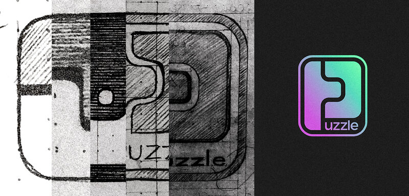
More than visible at first glance
Logos are functional art. But how do you create such a small piece of art? The development process of an identity.
▽Dec. 30, 2019|Felix Kuchar
designbrandingfelix
To show you how a logo develops and why it does exactly what it is supposed to do, I take you along through the different stages of development using the example of our company logo. These are the most important aspects outlining the process:
- Problem
- Research
- Calibration
- Logo Design
- Icons & Colors
However, before I begin, I would like to clear up a question asked several times recently, which was not answered neither in the first nor in the second part of this series.
What is a designer?
Whereas for some professions, the respective actions can be defined quite easily, this is not as simple when it comes to designers. I will try to break it down into the basics:
A designer designs things, so that they can perform their task better.
In doing so, the designer indeed has artistic standards. However, as opposed to pure artists, who purposelessly create things, the designer’s purpose is to improve the object with his or her design. So he or she creates utility art, to some extent.
This does not only imply visual changes, but also optimization of the entire look-and-feel. In this sense, the so-called UX designer, who is in charge of an object’s entire user experience, is the most general representative of her discipline. There are (almost) innumerable specializations in this field. Designers for products, graphics, typography, user interfaces, packaging or websites, to name just some of the most common forms.
Sometimes one might think that he could have painted this or that logo himself in a short time and that hence a designer is not required. However, this is a snap judgement, as the painting process is just the tip of the iceberg. Instead a good designer can solve holistic presentation problems.
Problem diagnosis
However, to solve such problems, of course first of all a thorough diagnosis is required. A good analogy might be a medic. Imagine the scenario: a patient sees a doctor and is prescribed the same pill over and over again, without any communication. Basically this sounds absolutely absurd and shows at the same time, why it is absolutely necessary to diagnose the problem first, before anything is administered.
As already described in the first article, it is thus necessary to do a brand strategy workshop with all decision makers. The latter might generally include those responsible for marketing, sales and management. So these are equivalent to the CMO (Chief Marketing Officer), the CSO (Chief Sales Officer) and the CEO.
In some companies, now there is even a CBO, i.e. a chief brand officer. Marty Neumeier reports in The Brand Gap, that though this is still a very recent position, it increasingly gains in importance nowadays. The CBO is in charge of implementing the corporate identity in all of the company, so that the corporate image can appear unified and consistent. This is particularly relevant to all fields where the company makes contact with customers, such as customer service, advertisement or marketing. Here, the goal is to always trigger the same feelings in all interactions of the customer.
To be able to clearly elaborate these fields, it helps to determine so-called personas, i.e. exact customer profiles. For that to happen, I ask myself the following questions, for example:
- Who are they? (age, demography, education, origin, family, hobbies etc.)
- What do they do daily?
- Which problems do they face?
- What do they need to do/solve this or that?
- How do we solve this problem and with the help of what?
The brand promise, the core values of a brand identity and the corporate vision elaborated in the strategy workshop can (hopefully) serve as a clear guideline for the further branding process. This initially verbalized corporate identity is to be checked for the market positioning then. Which leads us directly to the next step.
2. Market Research
Before I start searching outside, in the first place my main concern is to gain way more background knowledge, to determine the exact differences and advantages compared with existing market participants. For this purpose, I rummage a bit through the company’s past and ask myself once again completely impartially:
- How did the idea of founding come up?
- What happened so far?
- Where shall the company stand in the future?
- Who are the competitors and where do they stand?
These question provide very important answers that help the designer to be maximally loaded with the brand, so that she can let her subconscious mind already work in the background. At the same time, the answers to the questions mentioned above are a huge added value for the company. Many companies do not always have the time to make an employee available for this work. On the other hand, it will be of great advantage, particularly for start-ups, as they might not have dealt with one question or another, yet.
So I search for competitors and have a look at a cross section of the respective sector. This market analysis serves to find reliable arguments for or against a stylistic direction and to avoid too much similarity in the branding.
3. Calibration
Subsequently, the characteristics that have only been determined verbally so far, are to be calibrated visually. On that account, I use diverse designer platforms such as dribbble.com or behance.net. Sometimes I even have a look at pinterest.com.
For the search on these platforms, I combine the keywords that resulted from the strategy workshop with anything that can prompt feelings. This includes landscapes, architecture, furnishings, pictures etc.
As we want to evoke feelings in the customer’s gut, we can thus transfer the keywords into a visual equivalent. The platforms show us pictures most people would associate this or that feeling with. A potential search might be:
- pleasant + interior
- trustworthy + design
- helpful + painting
When doing so, let your thoughts run free and do not limit yourself by any means. I try to pay attention to repetitive patterns and colors, to get a feel for the possible results. Of course I keep my mind on the positioning and the details from the research here, which quickly leads me to the next search combination. During the search, I safe the pictures that seem to be appropriate to me and that comply with the company values, into an own folder.
Overall, this is a very intuition-driven process, in which the decision for individual pictures should not take more than five seconds. No longer by any means, since otherwise, as already described in the first article, you start thinking rationally, which impedes the creative process. Please keep in mind that in this step, there is no right or wrong. We are on a discovery tour.
Subsequently, I start the filter process once again and have a closer look at all pictures saved. I remove all pictures that do not fit into the overall concept. From the distillate of my search I create several collages. The documents then serve as a basis for discussion with the decision makers.
This project phase is crucial to check whether the customer has similar feelings or thoughts when looking at those collages. Hence, whether the rough direction is right. Here, I ensure that in every collage, only one style is used. Those styles include a uniform coloring, contemplable types, pictures and target group equivalents, sample images, forms, design styles, …
In the discussion, indeed several styles can be followed, since so far, the rough direction has been determined, but not with which emphasis. Let’s say that the rather strong direction shall be followed for a characteristic. However, everybody relates something else with the meaning of strong. Now we can create a collage that might be called progressively strong and another one that is rather discreetly stronger. In these genres, the viewer will have different nuances of the feelings, which makes it easier for the decision makers to say what they like about a respective style.
And now I don’t want to keep you on tenterhooks, any longer, and proceed to the part of the article that contains more pictures, as now the creative process starts.
4. Logo Design
So far, firstly we managed to adjust it. We succeeded in turning what people have in mind and what they might have only been able to verbalize as of yet, into visual counterparts, which evoke exactly the desired feelings and thoughts in the viewer.
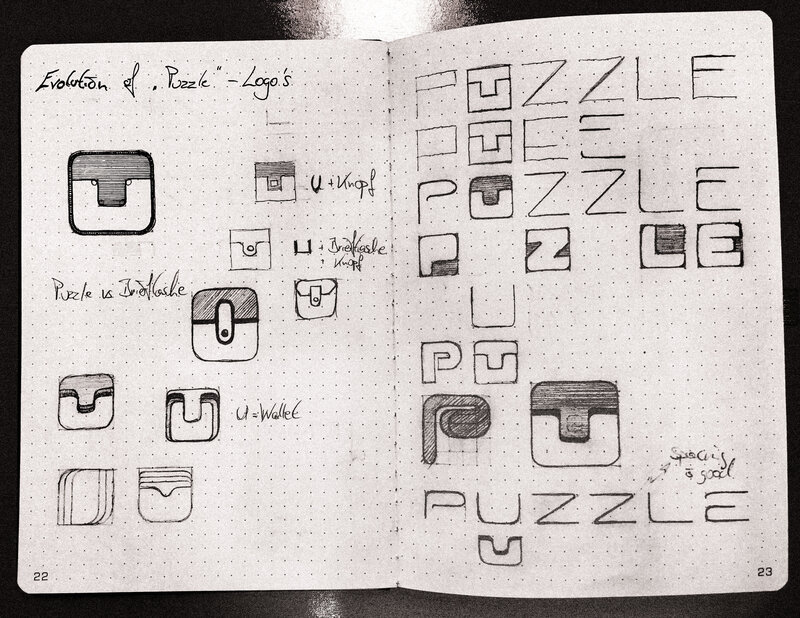
Now is the time when I sit down and try to create many quick and small sketches, again very intuitively. In doing so, I try to keep up with the pace of my thoughts and at the same time I try to not forget anything. In the intervening time, I often have a look at the collage that specifies the targeted direction, so that I also do not get off course when creating the sketches.
Every designer has its own workflow for that. For example, I always instantly play around with fonts and letters. But check it out yourselves.
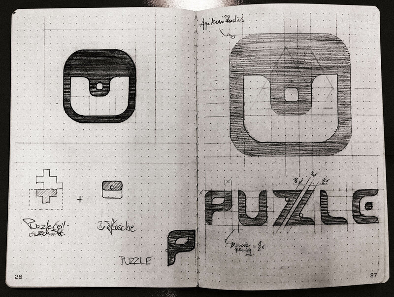
On this page, I still tried to implement the idea of a digital wallet. In addition, of course here I pursued the aim of integrating the logo into an iconic element. At this point, I was already quite convinced that I found something appropriate, as you can easily recognize part of a puzzle piece and a wallet button in abstracted form. However, in my opinion, this was too similar to Instagram, which operates in a completely different industry. However, too many customers have this style in mind and thus the difference is too small for our purpose. Subsequently, I iterated once again.
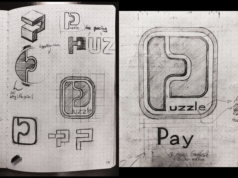
These are the last two pages in my sketch book, which then resulted in the initial concept. Here, I concentrated more on our unique selling point, instead of what we are in the first place - a digital wallet.
Of course our goal is to provide anonymous and safe payments. On the other hand, we give our customers the possibility to be able to actually pay everywhere with one app. In other words, we combine security and universality in an easy way.
This eventually caused to only visualize a puzzle in the form of a P. It symbolizes our universality and reminds us of familiar days of childhood, when we presumably all did a puzzle sometimes. Moreover, I also added a frame to visualize protection. The two parts of the abstracted P even remind of a credit card chip, additionally. Thus, we also referred to payments.
It is important to me to show you this process, since when looking at it, you realize that it does not matter where you come from, but where you are heading. Nothing is more constant than change. Thus, when designing, it is necessary to adjust to the marginal conditions as well as possible. Moreover, the multiple interations provide the opportunity to draw on many concepts. In the same breath, you improve your creativity to express thoughts and combine them.
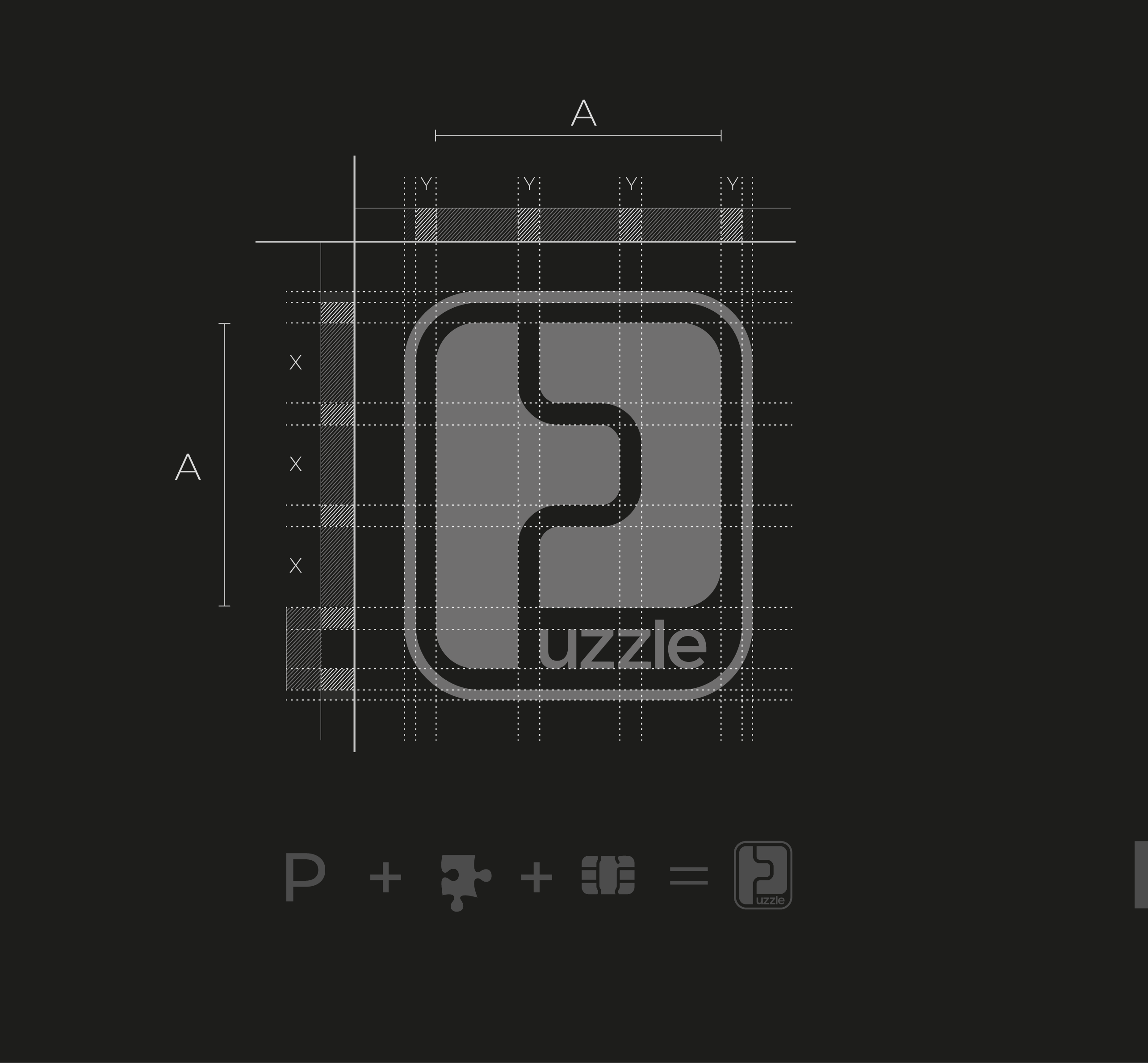
Once the sketches are finished so far, I take the concept and start to digitalize it with a vector program. Here, I create the logo the same way as on paper. When the concept is digitalized, the unification process goes further and in particular faster.
The next step is to find the font. For this purpose, I copy the concept and combine it with as many fonts that evoke the desired feeling as possible. However, as for Puzzle I was not happy with the common font families, I used three different fonts and changed it a bit here and there to create a suitable solution.

Here, I ensured that the letters have their shoulder height in the golden cut. Then I had to cut the L a little bit, so that it fits well into the logo. At the end, it was important that the small E ends in a round shape and has a rising end, as it better fits in the frame.
The P, combined with the font and filled with color, result in our current company logo.
5. Icons & Colors
A logo can have various forms and this is absolutely necessary nowadays. For every application setting, not only analogical, but also digital, maximum recognizability must be guaranteed. Thus, in his book The Brand Gap, Marty Neumeier states that all two-dimensional pictures, such as monograms, abstract symbols or word marks are products of print shops and mass media. Furthermore, he states that we are now living in a time when small variations of logos are more important than before, when print media were still the dominating medium.
Especially when using them online or on mobile terminals, new problems to be solved arise.
So I have to think about where the icon will be used potentially and optimize it accordingly. When it comes to smartphones, you have to e.g. consider the limited space and the short viewing time of the user. In former times, you could print the logo on huge advertising banners and in large-sized magazines.
As a rule of thumb, nowadays logos are to be reduced to the size of a stamp when designing them on-screen, to test whether they can also be used as an icon, since they are quickly recognizable or understandable. However, as our company logo contains relatively little font, it is not readable anymore in the size of a stamp. Thus, the logo cannot be directly used as an icon or avatar.
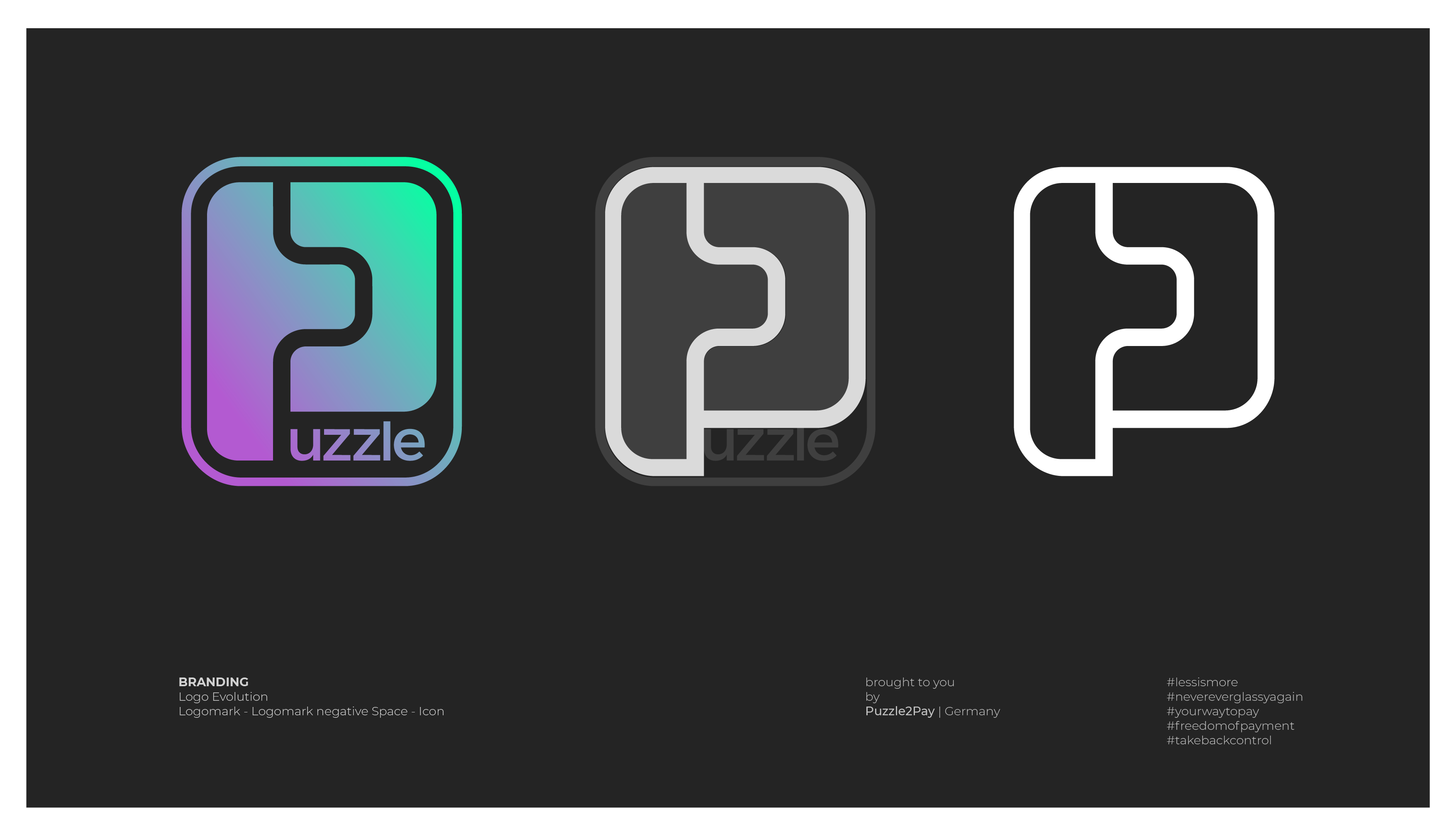
At this point you have to be creative, if you want to convert your concept into an abstracted icon. However, when it comes to our logo, there is a very elegant solution. In the following picture, you can see how, due to the negative space in our logo, a P can be presented in details, once more, that does not lack anything from the original form and still clearly relates to the original.
The icon newly created in this process can be used on the website. As you can see in the following picture, I instantly used it for further processing. As we develop a payment app, of course we need a corresponding icon. In addition, in times of social media, it is useful to also design something for their round avatars.
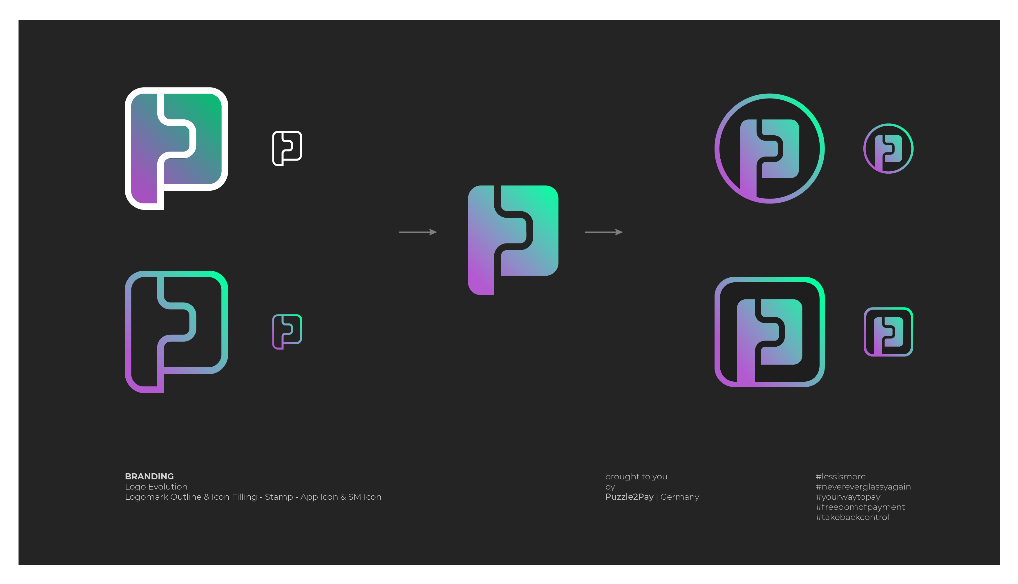
This whole process shows, that you can develop many different derivations for the respective required environment out of a good basic concept. For us, this includes among others app icon, favicon, icon, avatars for LinkedIn, Instagram, WhatsApp, Slack etc.
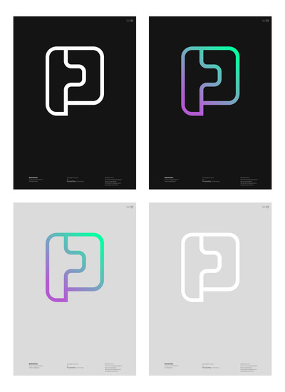
In the end I want to mention an important step in the creative process, the coloring. This also depends on the marginal conditions that have been detected in the research process. So again it is about determining differences and similarities. When choosing your colors, it is very important to test the logos on different backgrounds, so that you can eventually define diverse do´s and dont´s in the brand style guide.

Conclusion
In this series Logo: Expensive Scrawl or Real Game Changer?, I could give you a quite broad insight into the creative process of logo design on the basis of our logo and moreover show how it fits into the branding process.
It is important to me, that you take from it that a logo only bears the most obvious relation to a brand, but does not suffice to determine a brand in all fields. A logo, a monogram or an emblem are small functional pieces of art that are specially geared to the intended use. After having done a lot of research and after several iterations in the creative process, they are at the same time also the strongest binding element between customer and company. They are the condensed answer to a consequent use of the core values to communicate the company’s unique features.
In case you have a deeper interest in the topic of Design & Branding, that goes beyond what is presentable in a blog, I can recommend the following books.
Literature
Graphic Design
- Der Kanon - Massimo Vignelli
- Design: Logo - Von Glitschka
- Gittersysteme - Josef Müller Brockmann
- Know Your Onions - Drew de Soto
- Pretty Much Everything - Aaron Draplin
UI/UX
- Don’t make me think - Steve Krug
- The Design of Everyday Things - Don Norman
Creative Business
- Creative Strategy and the business of design - Douglas Davis
- Pocket Full of Do - Chris Do
Branding
- The Brand Gap - Marty Neumeier
- This is Marketing - Seth Godin
- ZAG - Marty Neumeier