Construction and Evaluation
How can a logo be constructed? On the basis of which criteria can it be evaluated eventually? Insights into the work of an art director.
▽Dec. 6, 2019|Felix Kuchar
designfelix
In this article, you can look over my shoulder and watch how I design our logo on paper. This will then be the template for the digitalization process. I explain why I use grid systems and I refer to the old masters of design, who intensively dealt with them. In the second part of this article, I show you what it comes down to when evaluating a logo, by reference to Apple and Starbucks.
Construction
In the above video, the step when the initial logo concept is refined, is shown. Before, a strategy workshop took place, a brand was developed, a name was found and a rough idea for the logo came up.
Every logo designer developed its own approach to refinement. Some just commit a few sketches to paper. They digitalize them as quickly as possible à la quick & dirty - and then continue to refine them at the computer.
On the other hand, I try to commit as many sketches as possible to paper, to already refine them to some extent. This enables me to engage in the process more quickly. This way I can better keep up with the flow of my thoughts. If I am satisfied with a paper version to some extent, I digitalize the sketch and fine tuning can begin.
Digitalization
You can simply take a picture of the sketch to digitalize it. You put it in the background of a vector program such as Adobe Illustrator as a semitransparent graphic. By doing so, you can reproduce the template exactly and constructively. However, this implies that you already worked on the sketch relatively exactly. In this approach, adjustments to the proportions are relatively complicated, as you have to work a lot on the final form.
Thus, I have a different approach. I rely on grids when designing. In principle, they serve as snap lines, to maintain the proportions of the individual lines, forms and spaces that I developed in the sketch form. In addition, they also help me to compose the parts harmoniously into an ensemble.
In the video you can see how, first of all, I already develop a grid system on paper. This makes it relatively easy for me to observe the limits previously determined, be it when painting the lines or when coloring the spaces of the logo.
What are grip systems?
Grip systems originate in medieval typesets. In the first place, I want to refer to the source of the Villard Canon, as one of the most famous constructions to determine the margins of a book.
From recent years, several Swiss graphic designers are to be mentioned. The book of Josef Müller-Brockmann on Grid Systems in Graphic Design or Karl Gerstner’s essays in Developing Programmes are still classics in their field. However, we should also not forget Jan Tschichold from Leipzig, who created a milestone with The New Typography.
These experts developed grid systems in the middle of the last century, to design magazines, posters, programs, fonts etc. In contrast to for example the golden ratio, these systems were primarily used to communicate the understanding of the content and only secondly to appear nice und appealing.
The insights of these rules, that have originally been developed for text and graphic alignment, can also be applied to the construction of logos. I will show you in detail how you can develop such grip systems yourself, in a following article.
Evaluation
One of the main tasks of an art director is to take care of a consistent public image in accord with the brand values. This also includes the evaluation of all graphically visible elements, hence also of the logo.
- What criteria can be applied to evaluate the logo eventually?
- Is the logo a good match for the brand?
- Is a Like sufficient for it?
Criteria
In my opinion, Sagi Haviv from Chermayeff & Geismar & Haviv, a New York design company, came up with the best answers to these questions. In an interview, he names three characteristics, a logo should combine, so that it works for the company in every setting for as long as possible and therefore is a good investment.
According to Sagi Haviv, a logo must be appropriate, distinctive and simple.
Appropriate
Appropriate means, that the respective feelings a logo provokes and the personality it demonstrates are suitable for the future brand environment. Of course the evaluaion of this criterion greatly depends on the brand itself.
As already mentioned in the previous article, the brand values are the result of a critical examination of different questions on the company, customers, goals, etc. These characteristics are the specific control indicators that allow us to assess the appropriateness of the visual creation.
Distinctive
Distinctive means, that a logo is so striking, that it is easily memorable. The best test for it is letting the logo be drawn from memory. The more successful the average does so, the better the designers did their work.
Simple
Simplicity means leaving out aspects that to do not add to the logo’s value. This can be achieved best by designing the logo as simply as possible, allowing the eye to quickly capture the basic forms. Ideally, the logo is thus understandable the quickest way possible.
Example: Apple
Having a look at the Apple logo, you understand rather easily, how these rules are applied.
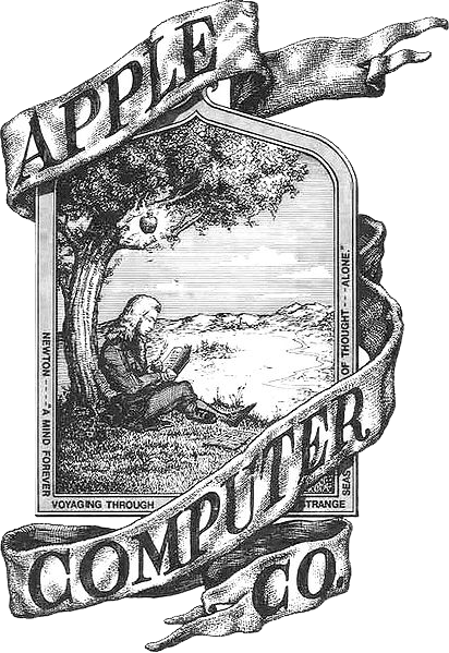
First Apple Logo
The first try in 1977 looked like this:

It tells the story of how Newton came up with the idea of the theory of gravitation, when an apple fell on his head. It combines Newton’s apple and the genious idea of the Apple Computer Cooperation.
Unfortunately, this try contradicts all three criteria for a good logo:
- The Logo is very complicated. It lacks abstraction. The idea is not clearly recognizable.
- Compared to old copperplate prints, the logo is not distinctive. It neither fits a technical device, nor a shop window.
- It is not appropriate. By solely emphasizing the founders’ brilliancy, it disregards other brand characteristics, completely. It neither radiates simplicity, nor design or innovation.
For these reasons, the logo did not last very long.
The apple of 1978
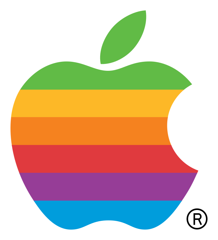
Rob Janoff already developed the iconic form of the bitten apple with leaf in 1978. Back then still including multicolored stripes to remind of the color display of the Apple II.

The bite points out that it is an apple and not a tomato or cherry. The leaf makes it distinctive and as it is justified from bottom left to top right, it gives the logo a positive dynamic.
The entire form is so simple, that it is instantly recognizable and many people can even paint it.
The logo since 2003

Compared to the original design, the current logo even goes one step further. It is only monochrome. This enables a broader scope of application. This way, the logo can be used in larger sizes and more prominently in black, white, silver, grey and so on. So it is appropriate for more situations. At the same time, the logo goes very well with Apple’s simplicity.
Example: Starbucks
Many people falsely assume that a logo must correspond to a real equivalent, by all means. Or that it must look like something that can be understood, instantly. It is certainly great, if a designer manages to do so. However, it absolutely suffices if it has the iconic characteristics mentioned above and just creates the feelings or a certain atmosphere that consort with the core brand values.

Starbucks is a good example for such a logo that has not much in common with the company, name and product. The mermaid or siren has nothing to do with coffee itself. But it is associated with positive connotations and it is pretty to watch.
They probably came up with the logo, because Starbuck is the bosun in Moby Dick. As if the bosun wants his coffee preferably delivered by a mermaid.
Originally, the siren was visible in its entirety and surrounded by the company name. In the meantime, she stands alone and solely serves as a recognizable element for the company Starbucks and its values, such as warmth and belonging and challenging the status quo.
Result
In the video above, you could look over my shoulder and watch how I design our logo on paper. Upon digitalization and coloring with the Puzzle2Pay color scheme, the result looks like this:

Furthermore, I described how to evaluate a logo and how to get a better measure of a company’s image. So what do you think of our logo? Do you maybe know even better evaluation methods?
Please write us, what you think. We have an open mind on any thoughts.